Author Archives: Chandler O'Leary

Mission La Purisima sketch by Chandler O'Leary

Rural retreat

This is the ninth installment of my Mission Mondays series, exploring all 21 Spanish Missions along the California coast. You can read more about this series, and see a sketch map of all the missions, at this post.

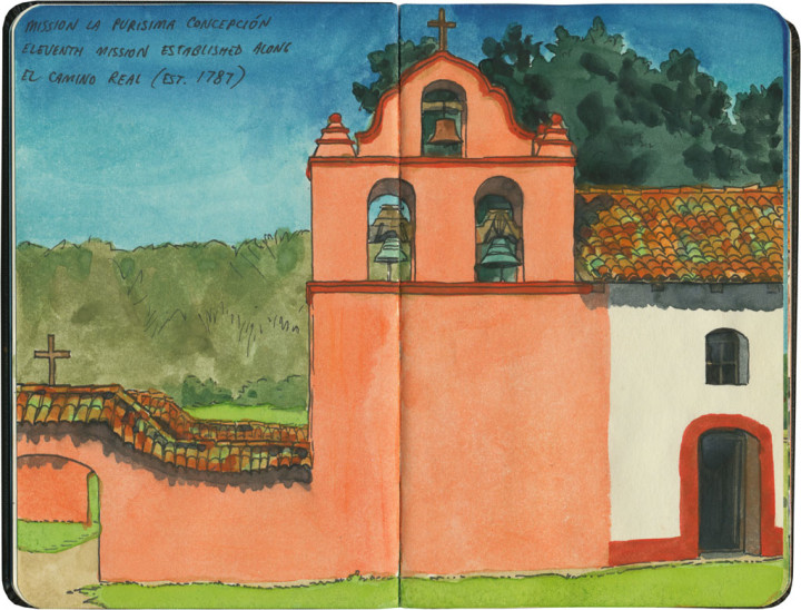
Mission La Purisima Concepción was probably the one for which I did the least amount of research—the mission I knew the least about. I’m so glad I showed up there without doing my homework first, because it ended up being both a complete surprise and my very favorite mission.

Detail of California Missions map sketch by Chandler O'Leary

La Purisima is unique in a couple of ways: in the first place, it’s one of only two in the chain that have been deconsecrated. Now that it’s no longer an active church, it’s now operated as a California state park.

Mission La Purisima sketch by Chandler O'Leary

The other unique thing is that La Purisima is the only mission in the chain to still include the entire mission complex. Most of the missions are down to just the church and gardens, but this one still encompasses the adjacent monastery, workshops, cemetery, and remnants of the mission village.

Mission La Purisima sketch by Chandler O'Leary

Much of what’s there today was reconstructed by the CCC in the 1930s (like most of the missions, it was badly damaged in a long-ago earthquake), and currently maintained by the state park system.

Mission La Purisima sketch by Chandler O'Leary

I think I arrived not long after a recent restoration, because the place was in fine fettle.

Mission La Purisima sketch by Chandler O'Leary

Best of all, I had almost the whole place to myself—which, combined with its remote location, made it feel like I’d stumbled upon a bit of hidden treasure.

Mission La Purisima sketch by Chandler O'Leary

I could have stayed there all day, basking in sunshine, birdsong and the sweet spring breeze.

Mission La Purisima sketch by Chandler O'Leary

But what really bowled me over was that gorgeous pink stucco.

Mission La Purisima sketch by Chandler O'Leary

Instead of a historic shell, inhabited only by ghosts, that pink made the place feel very much alive.
Pea Soup Andersen's sketch by Chandler O'Leary

Soup’s on

Now this is more like it. Solvang might have seemed a little too much like a polished Disneyland for my taste, but in the next town over was something much more my speed.

Pea Soup Andersen's sketch by Chandler O'Leary

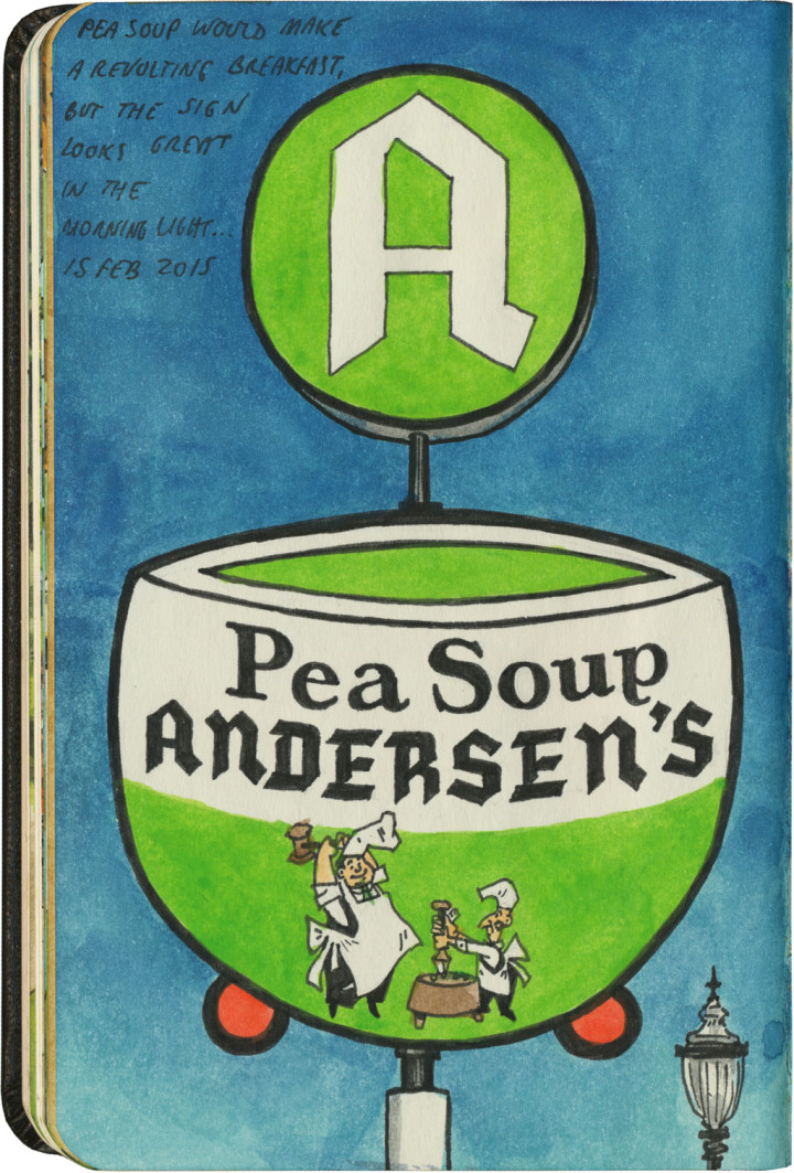
Though its name has changed slightly over the years, Pea Soup Andersen’s has been a Santa Ynez Valley institution for over 90 years. And while I’m not sure their famous split-pea soup is quite as home-cooked as it may have been in 1924 (it tastes fairly processed, I’m sad to say), there’s something comforting and homey about sitting down to hot soup after a long day of travel.

Pea Soup Andersen's sketch by Chandler O'Leary

And the decor! This is the kind of low-brow charm I was hoping for in Solvang. Every inch of the place is Danish-ized to the hilt (but in a far less polished way than in Solvang), and there’s a heckuva gift shop that’s worthy of the best roadside attractions.

Pea Soup Andersen's sketch by Chandler O'Leary

And there’s one other thing Andersen’s has that Solvang doesn’t: killer neon.

(They had me at the neon.)

Solvang sketch by Chandler O'Leary

Cheese Danish

I think you know by now that I’m a fan of roadside attractions—anything cheesy, hokey, corny and kitschy has a special place in my heart. But I need to clarify something: I’m pretty snobbish about my kitsch. It’s got to be either bizarre but well-executed, or so bad it’s good, or of epic scale—or else just so wonderfully earnest that no matter how lame it is, it melts my heart.

Solvang, California is none of the above, and I’m not sure how I feel about that.

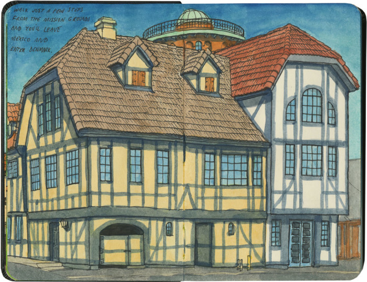
Despite having a Spanish mission on site for a hundred years already, the hamlet of Solvang was founded and settled in 1911 by Danish immigrants coming from the American Midwest. Its famous half-timbered mock-Danish architecture, however, didn’t start appearing until after World War II. Some of the buildings—like the 1991 scale replica of Copenhagen’s Rundetårn, of which you can just see a snippet at the top of the above sketch—are very recent additions.

Solvang sketch by Chandler O'Leary

But the thing about Solvang is that all that ersatz European architecture is pretty darn well done: the craftsmanship is all reasonably solid and the theme is consistent throughout town. And that kind of irritates me!

There’s something else, too: Wall Drug, and the Corn Palace, and Lucy the Elephant, and all the other roadside greats might be oddball anomalies and hokey destinations—but weird as they are, each is the genuine article. Solvang is a replica—worse, an approximation—of something that already exists. If I had the choice, I’d rather just buy a ticket to Denmark, and sketch the real thing.

And here’s the hardest part for me to swallow: Solvang is fake, sure, but it’s professional fakery—the kind you find at a theme park (incidentally, I loathe theme parks). The faux-Danish veneer is carefully considered and well-crafted enough to be attractive. I mean, I liked it well enough to take the time to sketch it, right? Yet the town doesn’t quite have the endearing charm of a place like Wall Drug: the overwhelming effect of an amateur with perhaps more skill than taste, more business savvy than artistry. It’s no Disneyland, thankfully (though the town’s copy of the Little Mermaid sculpture comes close), but it’ll never make my list of favorites.

I know, I know. What kind of nut case writes critical essays on the relative artistic merits of ersatz period architecture and oversized folk art? Well, my kind of nut case, apparently. I guess this is what happens when you send a chronic road-tripper to art school. Sigh.

So okay: Solvang gets a pass for being pretty—and for giving me access to fresh-baked æbleskivers. But I’d really like it if it also had a few lumpy concrete sculptures and clumsy ho-made signs to its name.

Mission Santa Inés sketch by Chandler O'Leary

Mixed-metaphor mission

This is the eighth installment of my Mission Mondays series, exploring all 21 Spanish Missions along the California coast. You can read more about this series, and see a sketch map of all the missions, at this post.

For most of the missions along El Camino Real, the mission itself is the main feature (and tourist draw) for each mission town along the way. That’s especially true for places like San Juan Capistrano, where the mission provided not only the origin of the town, but also the model for all architecture and tourist themes to follow.

Detail of California Missions map sketch by Chandler O'Leary

That may once have been the case for Mission Santa Inés as well, but you’d never know it these days. That’s because the mission is located in the town of Solvang—a tourist draw all by itself, and a town inspired by a completely different aesthetic than that of the Spanish mission (as you’ll see in the next post—I don’t want any spoilers to detract from the, er, mission of this one).

Mission Santa Inés sketch by Chandler O'Leary

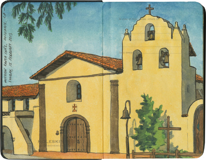
Still, if you knew nothing of Solvang itself—or if you happened to approach the mission from the east, and hadn’t yet seen any sign of the town’s dominant architecture—you’d think Santa Inés were the best and only reason to visit. It certainly makes for an incredibly picturesque vista, perched above its namesake valley as it is.

Mission Santa Inés sketch by Chandler O'Leary

Solvang is famous in its own right, however, so it’s more likely you’d be there to see the town itself—and then you’d be surprised to discover there’s also a Spanish mission there.

Mission Santa Inés sketch by Chandler O'Leary

Still, while the mission feels a little out of place in Solvang, the whole area is a bit of a mish-mash of cultural influences. Even the mission itself was founded by Spanish colonists, named for an Italian saint represented by a Latin pun, established to convert local Indian tribes, adorned with a garden laid out in a Celtic cross pattern, and today an active center for the local Mexican-American community. It’s all just one big mixed metaphor now… and all the more endearing for it.

Baton Rouge old and new capitols sketch by Chandler O'Leary

Capital capitols

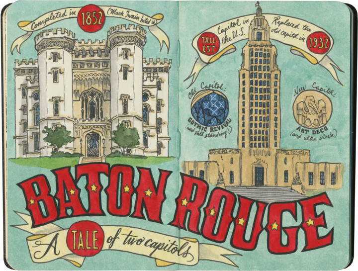
Mary-Alice and I were only in Baton Rouge long enough to grab a quick lunch and glimpse the city’s (fraternal) twin capitols—but that was long enough for me to add the city to must-return places. The new capitol—while lovely—mostly just reminded me of the Superman Building in Providence. It was the old capitol, however, that really captured my interest. I mean, the U.S. is positively filthy with dome capitols, but how many crenellated ones are there? (Answer: none, now that the one in Baton Rouge is no longer the actual capitol.) But what really got to me was that we didn’t have time to stop and see the inside of the old building. The exterior alone had me Googling away, and once I saw a few photos of the interior, I was practically ready to derail the rest of our trip plans and spend an extra day in there.

Ah, well. You know what they say: a reason to return.

Mission Santa Barbara sketch by Chandler O'Leary

Pastel parish

This is the seventh installment of my Mission Mondays series, exploring all 21 Spanish Missions along the California coast. You can read more about this series, and see a sketch map of all the missions, at this post.

Now, here’s a lovely thing. Mission Santa Barbara is one of the most well-known and beloved in the chain, and it shows. And it almost seems to be the companion piece to San Luis Rey de Francia: for one thing, while San Luis Rey is often called the “King of the Missions,” Santa Barbara’s been crowned the Queen by her fans. For another, both have beautiful pastel accents—Santa Barbara in feminine pink, San Luis Rey in baby blue.

Mission Santa Barbara sketch by Chandler O'Leary

Even the cemetery of Santa Barbara matches that of San Luis Rey, with its trio of skull-and-crossbones (though unlike San Luis Rey’s Hollywood touches, Santa Barbara’s are original).

chandler_oleary_california_missions_map_santabarbara

Santa Barbara also stands out because it is so lovingly cared for. Located in the affluent town that owes it name to the mission, Santa Barbara has been painstakingly restored and maintained–unlike her somewhat more inner-city brother San Gabriel.

Mission Santa Barbara sketch by Chandler O'Leary

At first I was a little overwhelmed by the sheer size and scale of the place, and worried I’d never be able to pick a vantage point for my sketchbook.

Mission Santa Barbara sketch by Chandler O'Leary

But in the end, it was the details that really had me smitten. Between the pink accents (I’m a sucker for pink), the careful stonework and the magic-hour light, the compositions really chose themselves.

Fourth of July sketch by Chandler O'Leary

Fire up the grill

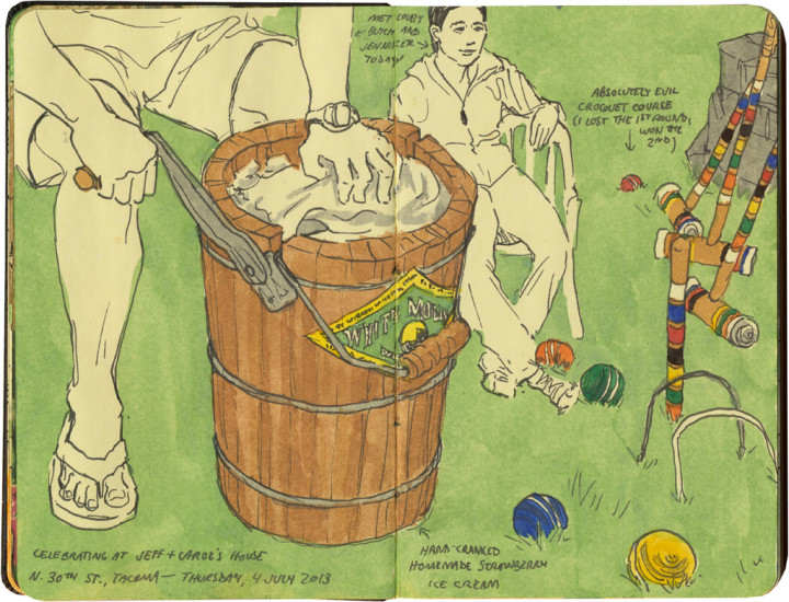
We have a tradition of spending the Fourth with some friends who live down the street from us. We bring the old-fashioned hand-crank ice cream crock and the croquet set—they fire up the grill.

Fourth of July sketch by Chandler O'Leary

The best part, though, is watching the fireworks over the bay.

To everybody reading in the United States, have a happy and safe Fourth of July!

Mission San Buenaventura sketch by Chandler O'Leary

Reconnaissance mission

This is the sixth installment of my Mission Mondays series, exploring all 21 Spanish Missions along the California coast. You can read more about this series, and see a sketch map of all the missions, at this post.

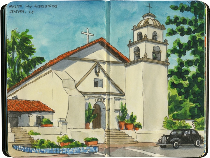
Well, I don’t have much to report this week—because this was pretty much all I was able to see of Mission Buenaventura.

Detail of California Missions map sketch by Chandler O'Leary

By the time I got there (fighting fierce L.A. traffic and a mass exodus to the beach all the way), the place was already closed for the day.

Mission San Buenaventura sketch by Chandler O'Leary

So what little I was able to see of this place was what I managed to glimpse through the fence, craning my neck to make out the details of the beautiful Mexican tilework on the fountain (that tilework is also placed around downtown Ventura, so at least I got a good eyefull of it there!).

Mission San Buenaventura sketch by Chandler O'Leary

But hey—all the more reason to return, yes? And thanks to what I like to think of as a first “reconaissance mission” to Ventura, I’ll know exactly where to pick up where I left off.

Milwaukee Avenue sketch by Chandler O'Leary

Secret enclave

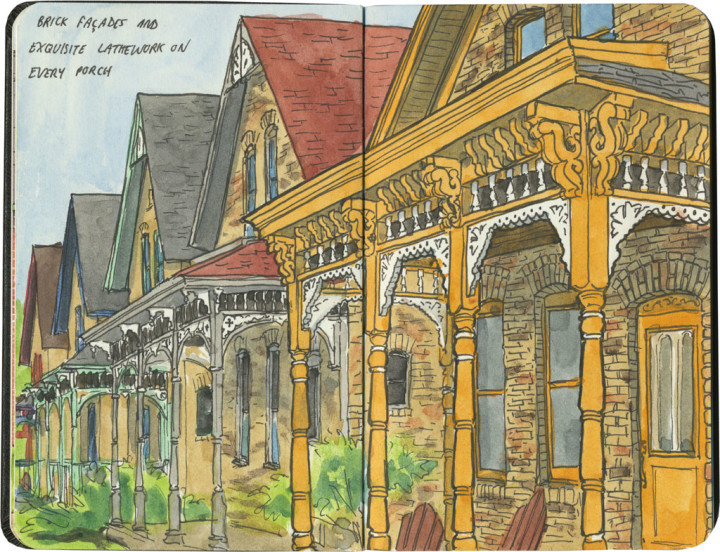
Revisiting Ladd’s Addition last week reminded me of another favorite neighborhood of mine. Well, not so much a neighborhood as two perfect blocks: Minneapolis’s Milwaukee Avenue.

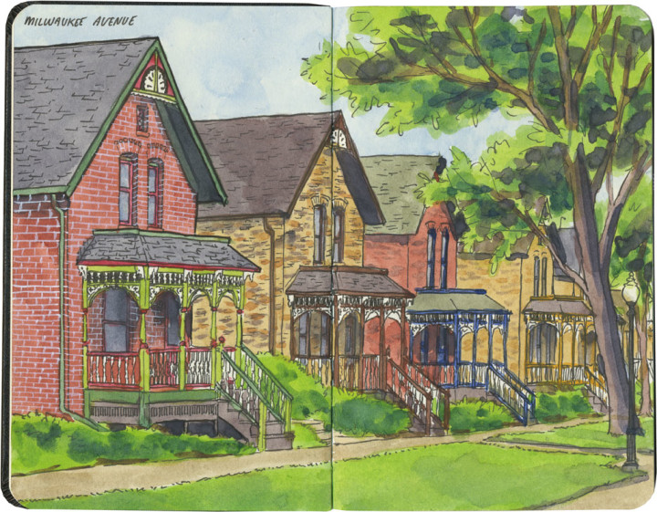
Today Milwaukee Avenue is a two-block stretch of pedestrian-only street: originally named 22 1/2 Street, to the unwitting eye it just looks like an alley between 22nd and 23rd. It opens onto the busy Franklin Avenue to the north, but the entrance there is overgrown with shrubbery, so it’s easy to overlook and pass right by. In fact, like Salmon Beach in my own town, I’ve met locals who have lived in the Twin Cities for years and never knew it was there.

If you do know where to look, or you happen to stumble upon one of the entrances, finding Milwaukee Avenue is like stepping into a tiny, different world. To me, it always felt like walking onto the set of an old movie like To Kill a Mockingbird. (I always half expected to meet Boo Radley sitting on a porch somewhere.) And if the street has that movie-set feeling of being slightly artificial, well, that’s because it is.

Milwaukee Avenue sketch by Chandler O'Leary

Milwaukee Avenue started as a row of low-income immigrant housing in the 1880s. Like Ladd’s Addition, it was a planned neighborhood, but to keep them affordable the houses were nearly identical and constructed inexpensively (but well) with brick veneer over timber frames.

The neighborhood started falling into disrepair in the Great Depression, and by the late 1950s the houses were in shambles. Most had no indoor plumbing, and had been modified with ho-made repairs to the point that they bore almost no resemblance to what you see in the sketches above. In 1970 the City of Minneapolis made plans to demolish the whole enclave, but when the residents got wind of it, they took action on their own. In secret they applied to the National Register of Historic Places, and were approved as an historic district in 1974—suddenly the City couldn’t touch them.

Not every house survived the restoration (nine were so far gone they had to be razed), but the ones that did were outfitted with proper plumbing, new foundations and a host of repairs. The one-way street was turned into a tree-lined pedestrian mall. And best of all, the beautiful, original lathework porches, gone from pretty much every structure by then, were replicated and put back in place. So what you see now is a strange and lovely hybrid between historic relic and reimagined replica.

So if you ever find yourself in the Twin Cities, take a stroll down Milwaukee Avenue and transport yourself to a small, private universe. Just be warned that when you step back out onto Franklin Avenue, and the modern world assaults your senses once more, you’ll find yourself looking back over your shoulder with longing.