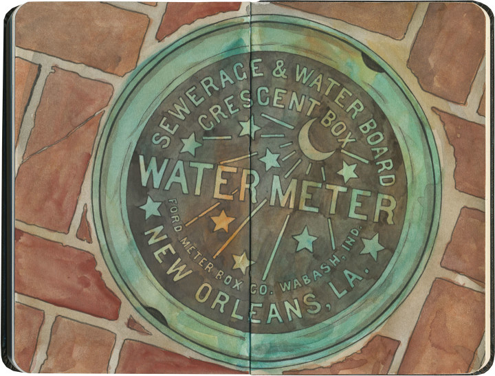
Speaking of Crescent City icons, in my humble opinion there is no finer example of utilitarian design anywhere. It’s been a long time since the era when “municipal” could be synonymous with “beautiful,” but the fact that these little meter box covers are still so famous and beloved today gives me hope. With any luck, other cities might just get on board, and inject a little beauty into even the most minute details.
Tag Archives: French Quarter
A street corner named desire
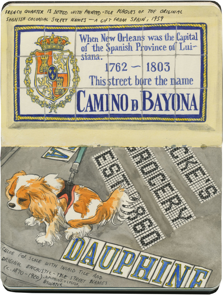
People like to categorize cities by things like food, or architecture, or climate, or whatever. Me? I like to categorize places by their signature style of lettering. So if I want midcentury neon Googie script, I might look along Route 66. For a good all-purpose wild-west Clarendon, look no further than Wall Drug. But if I want beautiful inlaid tile street signs, I’m heading straight for New Orleans. It’s not just the tile, either—the lettering itself is so unique it’s become an icon of the Crescent City.
Good thing, too—no offense to the designers of Highway Gothic and other wayfinding typefaces, but the French Quarter deserves something a little fancier than your standard green street sign.
City of lace
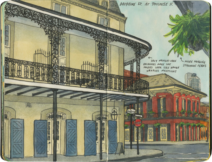
Today it seems only fitting to hop from one French city to another. Other than the obvious connotation of the French Quarter, the multi-colored houses also made New Orleans remind me of Montreal. The thing that set NOLA apart, though, was all that stunning wrought iron.
Since they call it the French Quarter, it’s easy to forget that New Orleans is just as influenced by Spain—that Creole culture is just as Spanish as it is French. The city’s wrought-iron balconies brought the lesson home for me. As I rounded every corner, all I could see were houses draped in lacy Spanish mantillas.